DISNEY JUNIOR
BRAND IDENTITY PACKAGE
CLIENT: BUENA VISTA INTERNATIONAL
Developing the new image of a channel is never an easy task, and doing it all from our homes, even less...
Summoned by Disney in mid-2020, the request was clear from the beginning, we had to transform the current image:
Summoned by Disney in mid-2020, the request was clear from the beginning, we had to transform the current image:
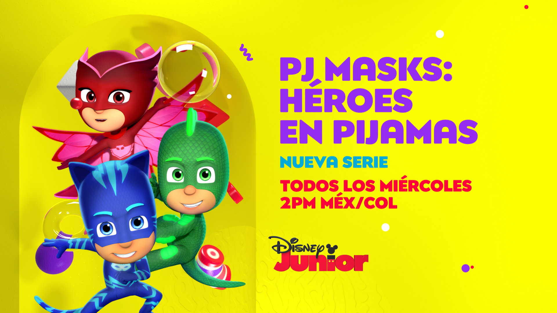
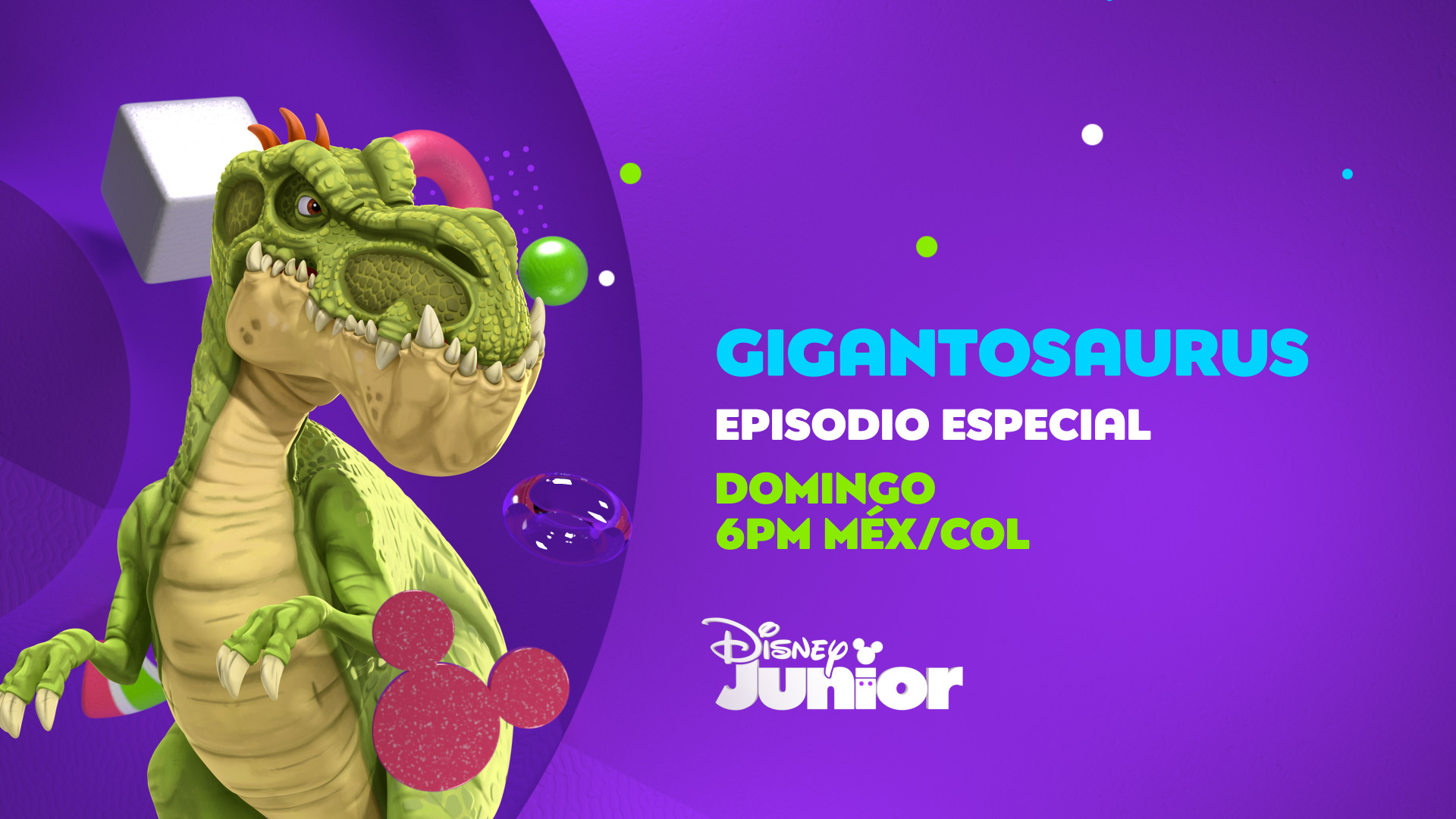
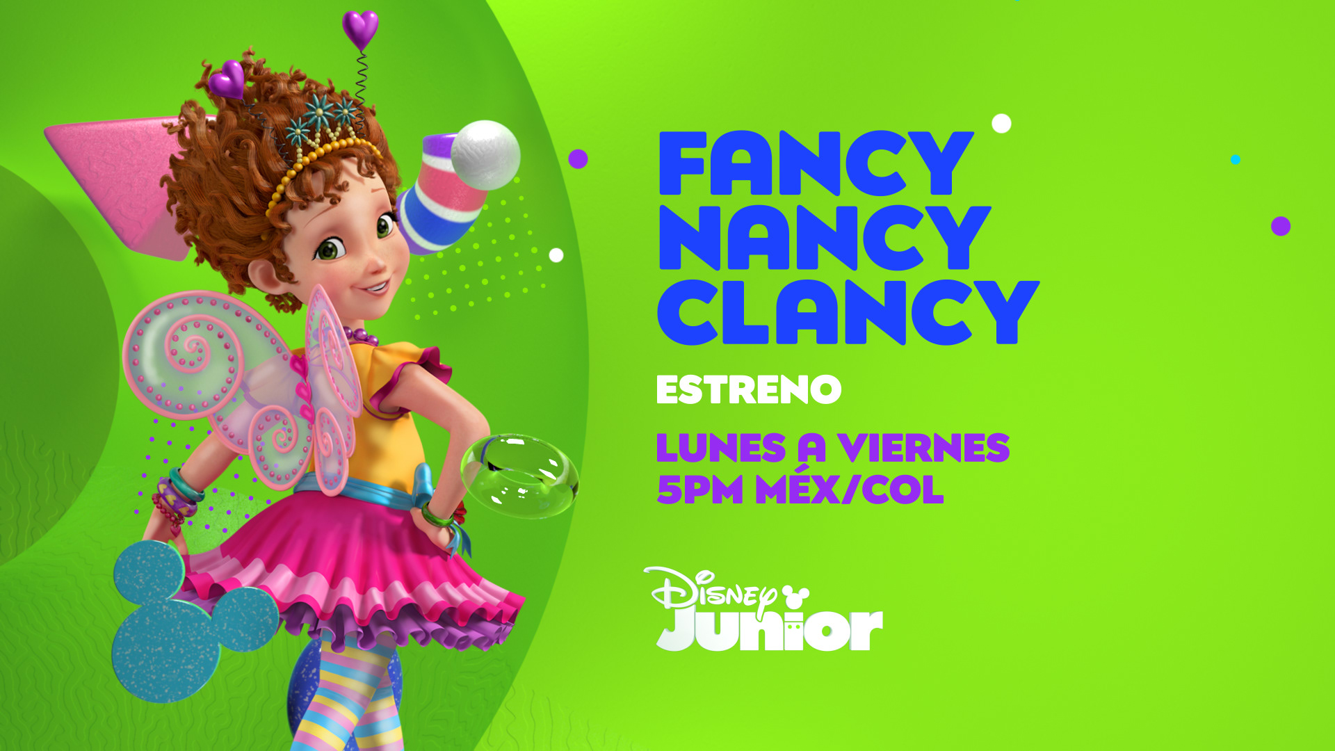
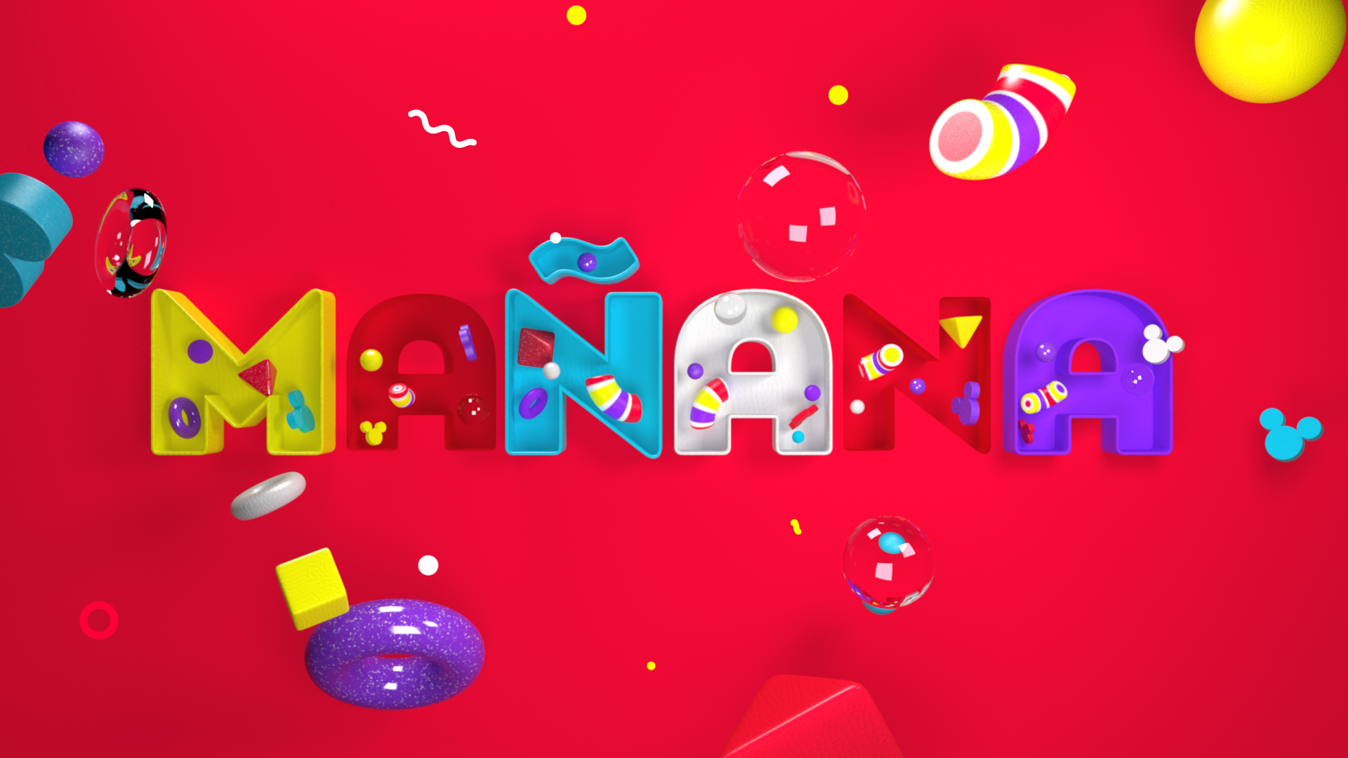
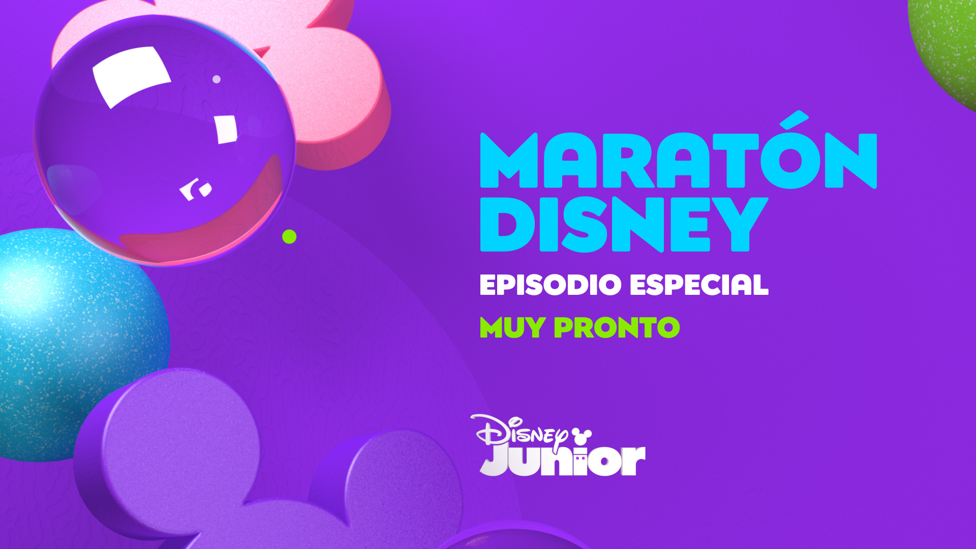
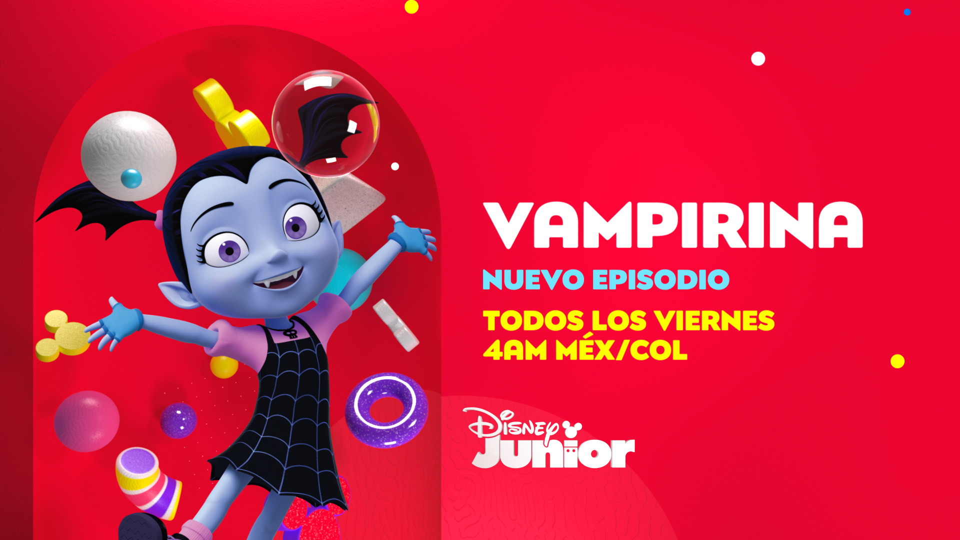
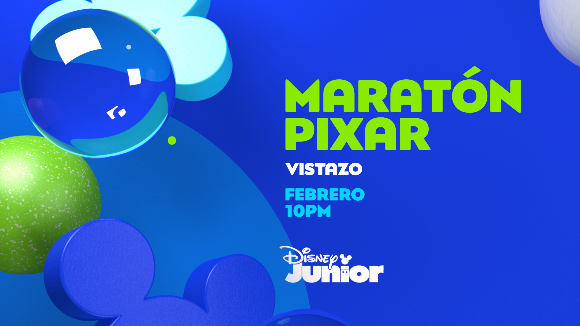
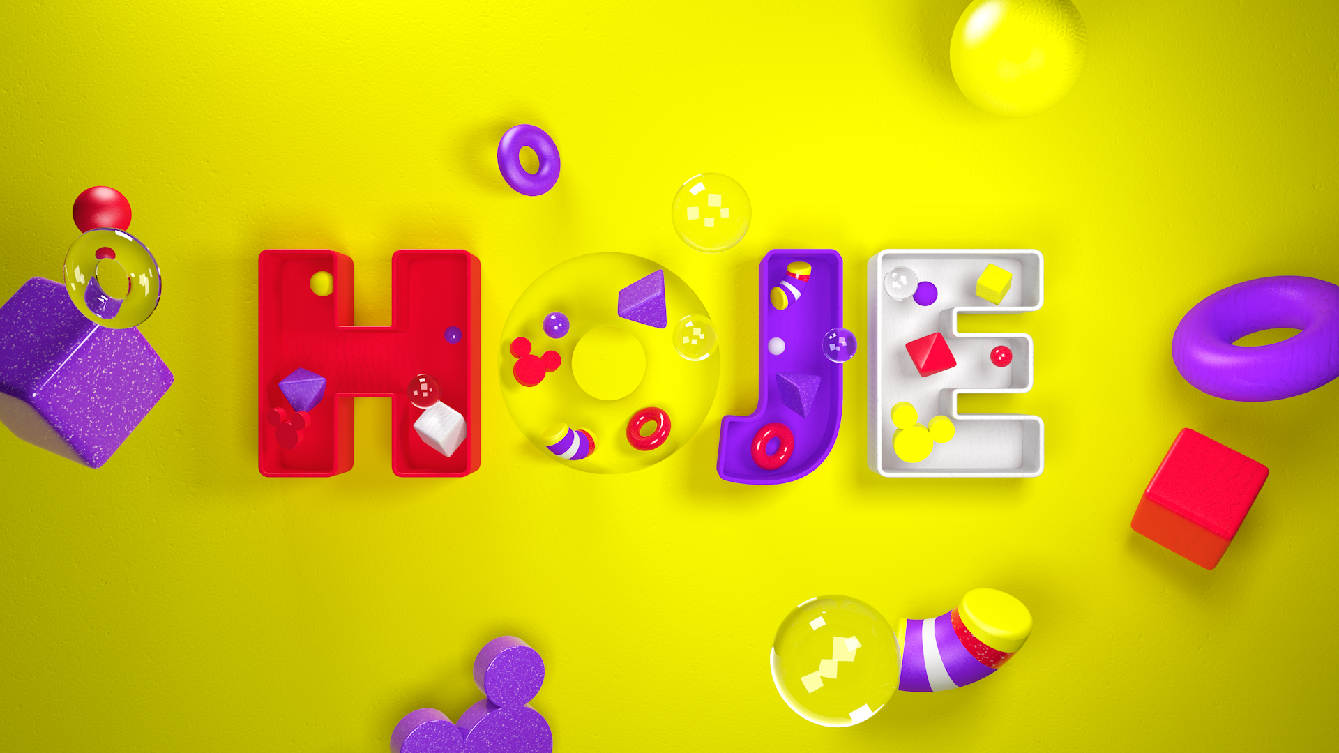
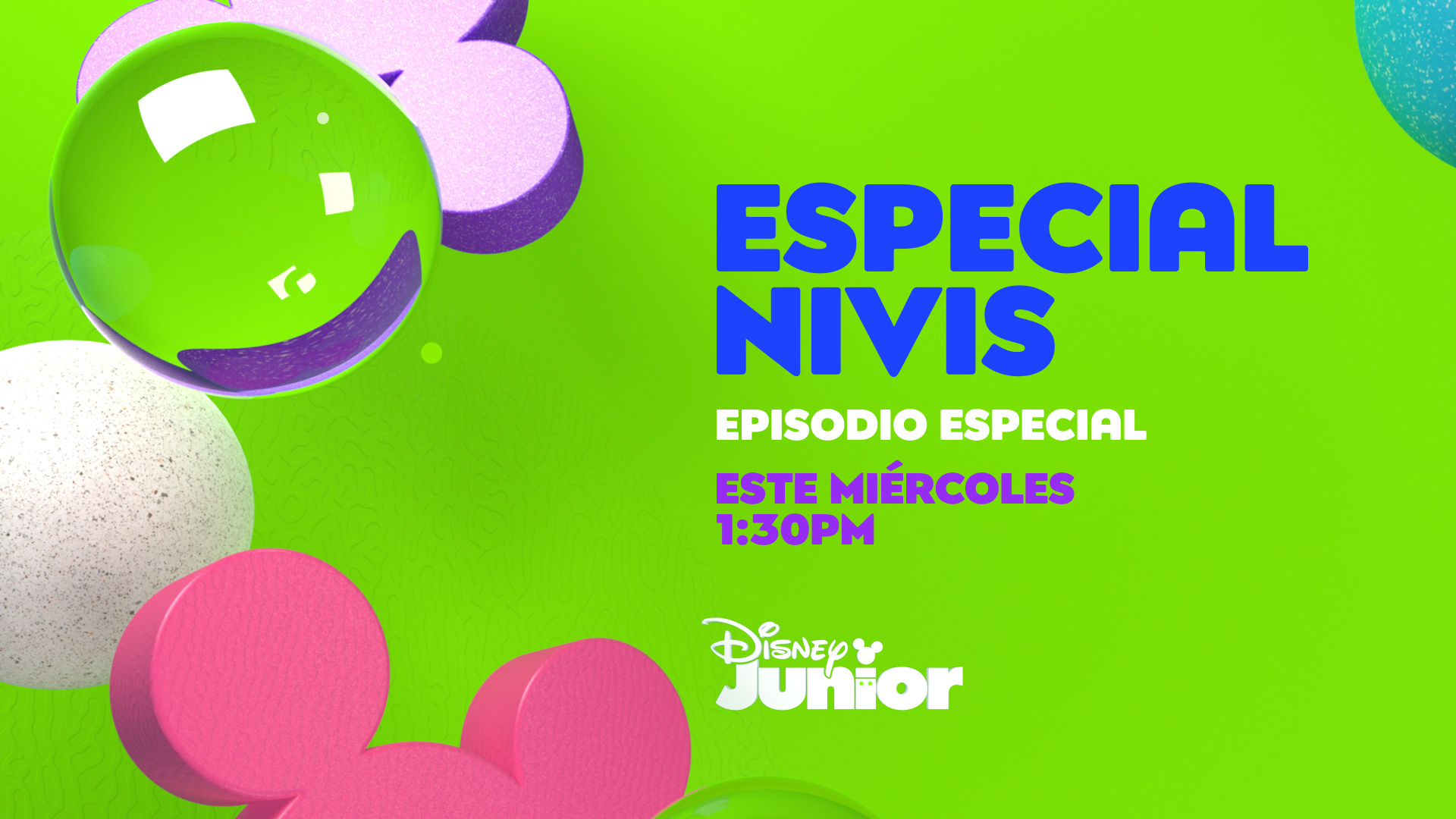
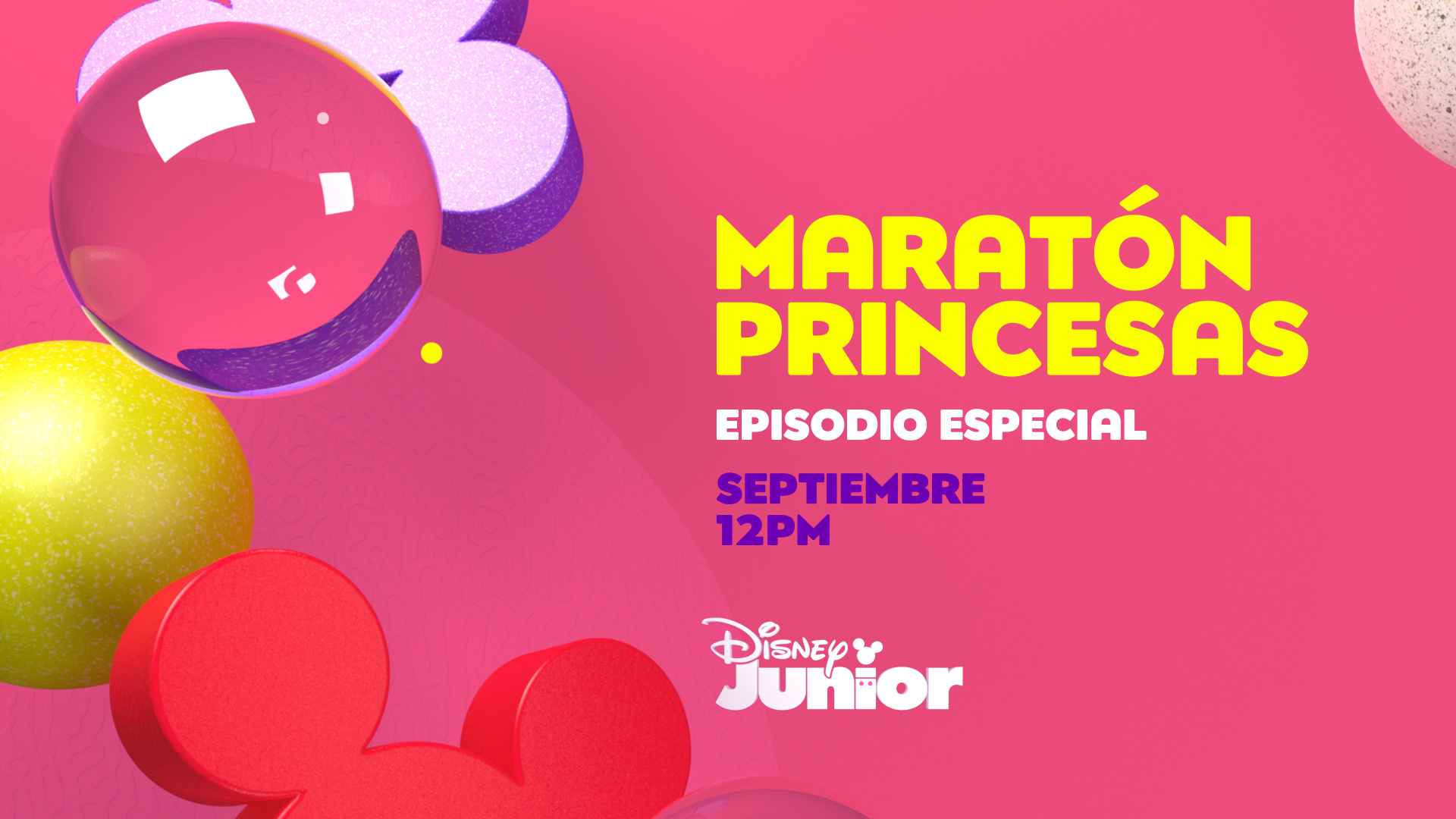
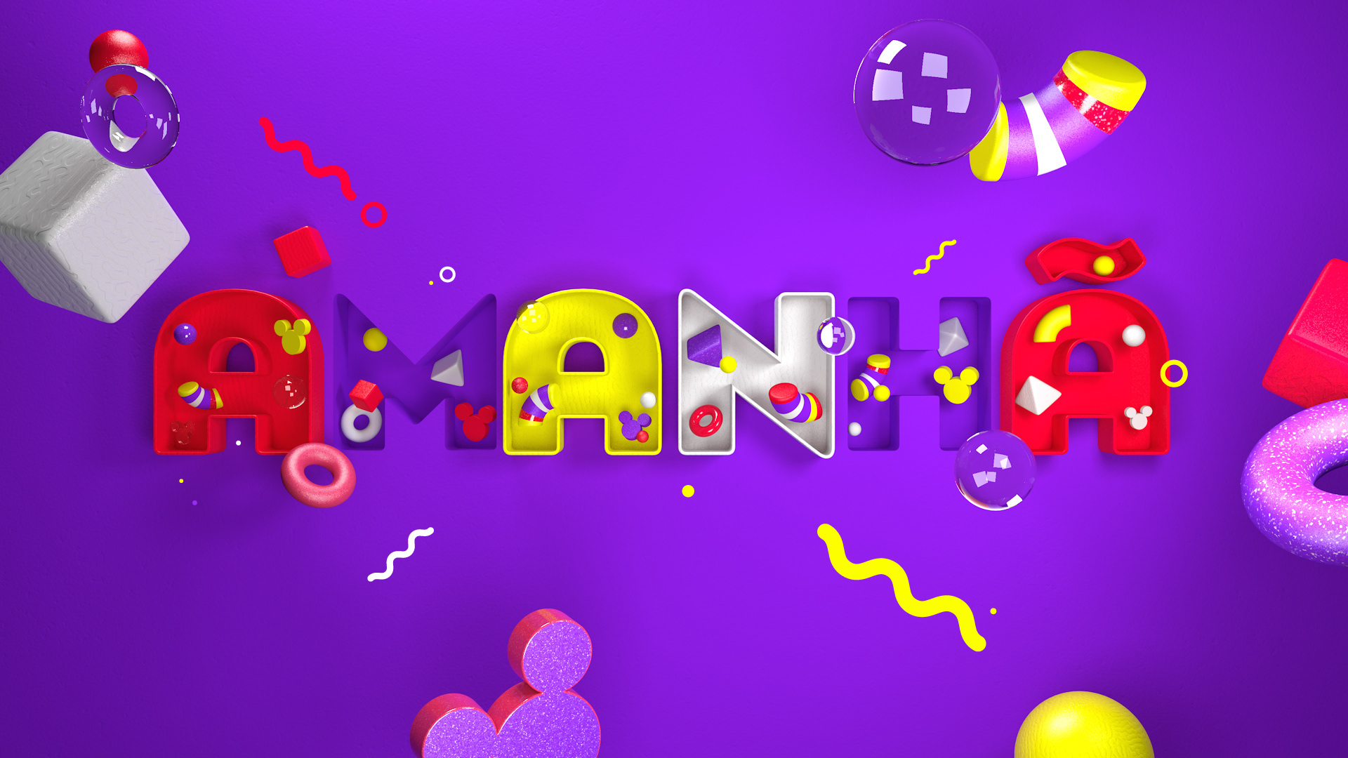
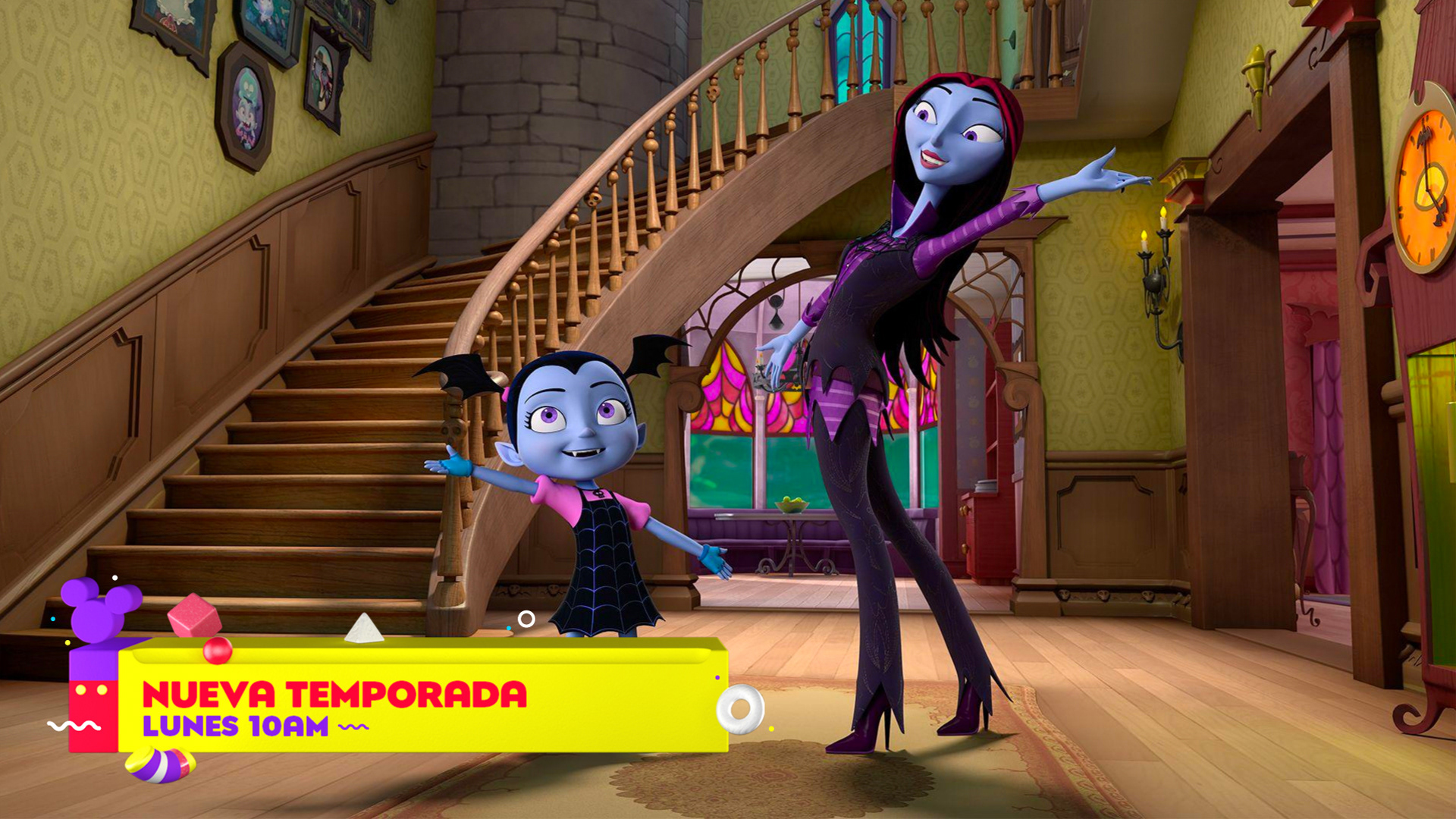
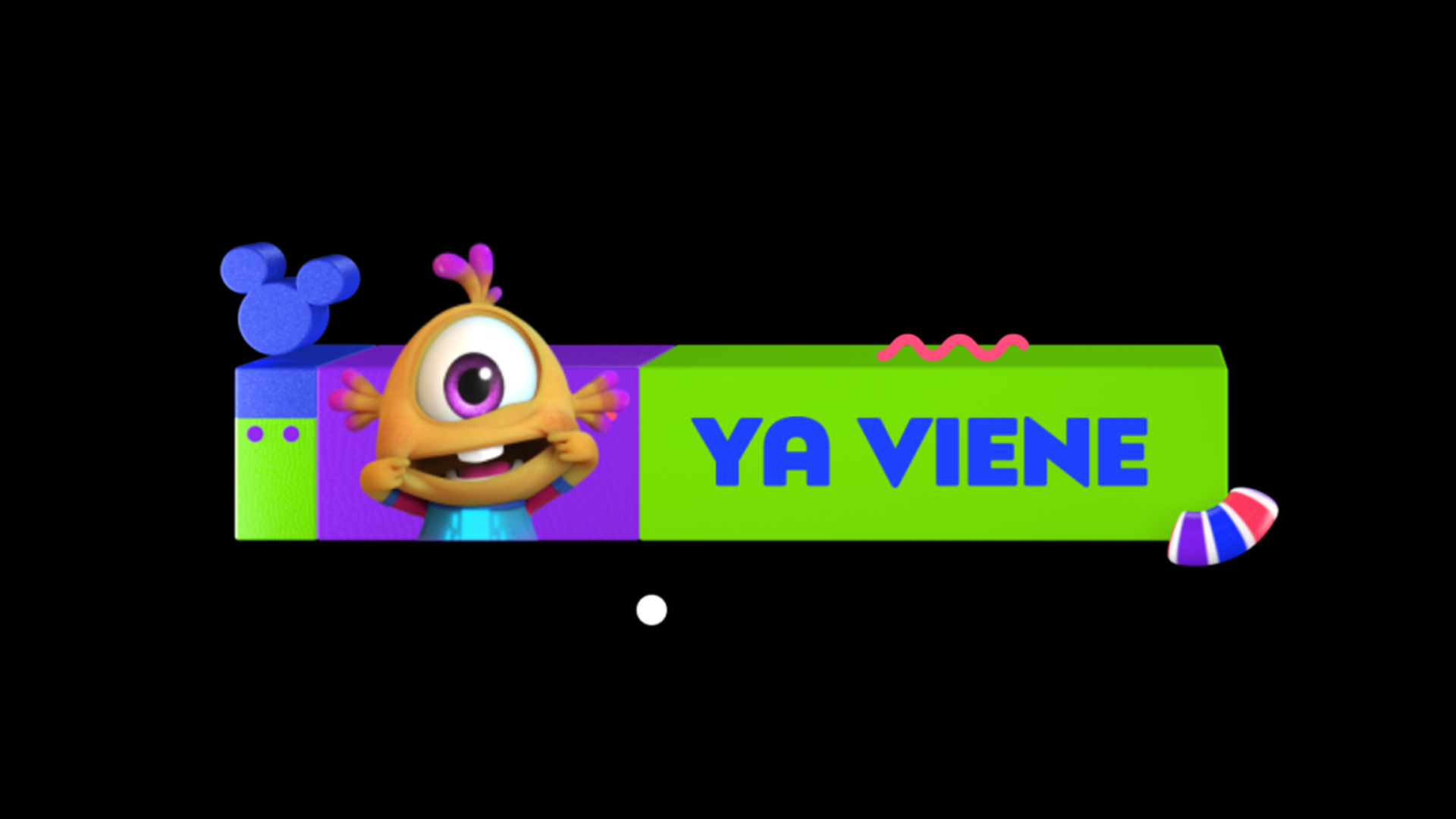
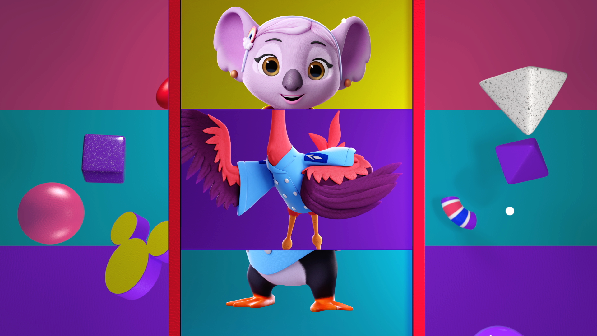
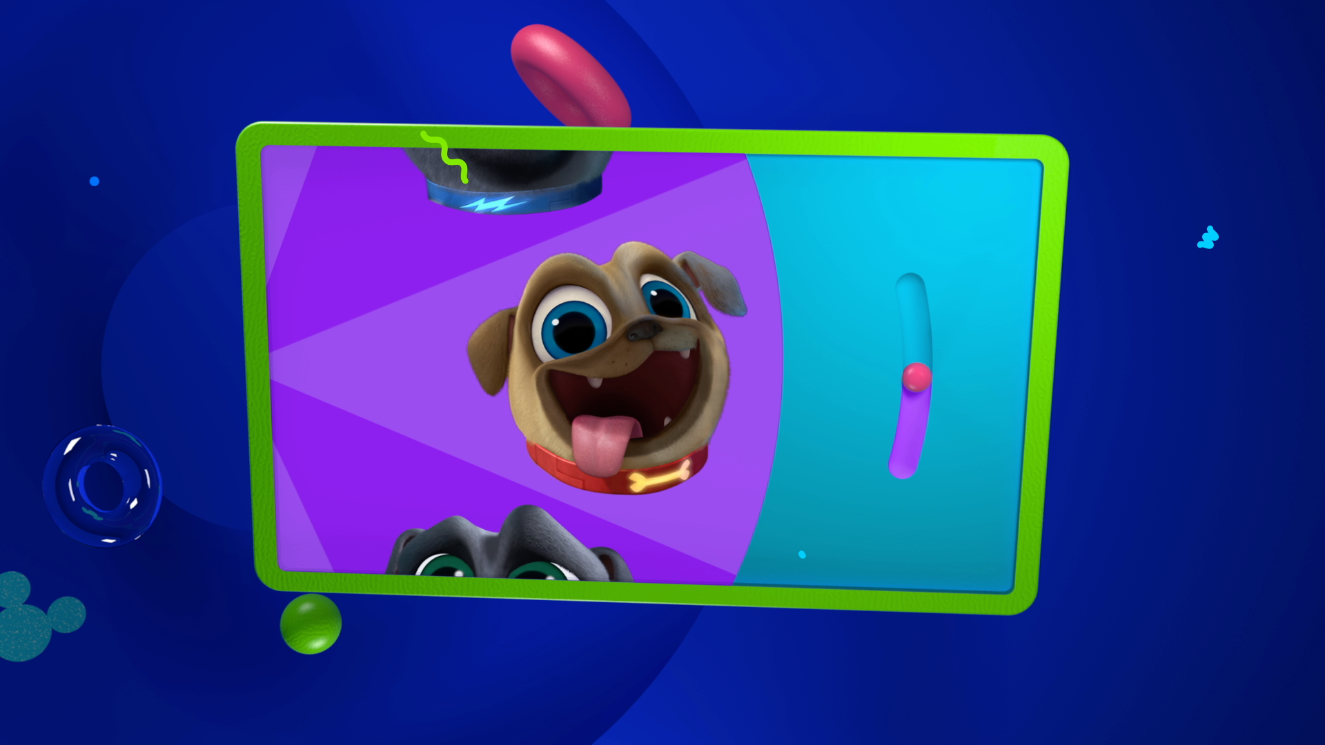
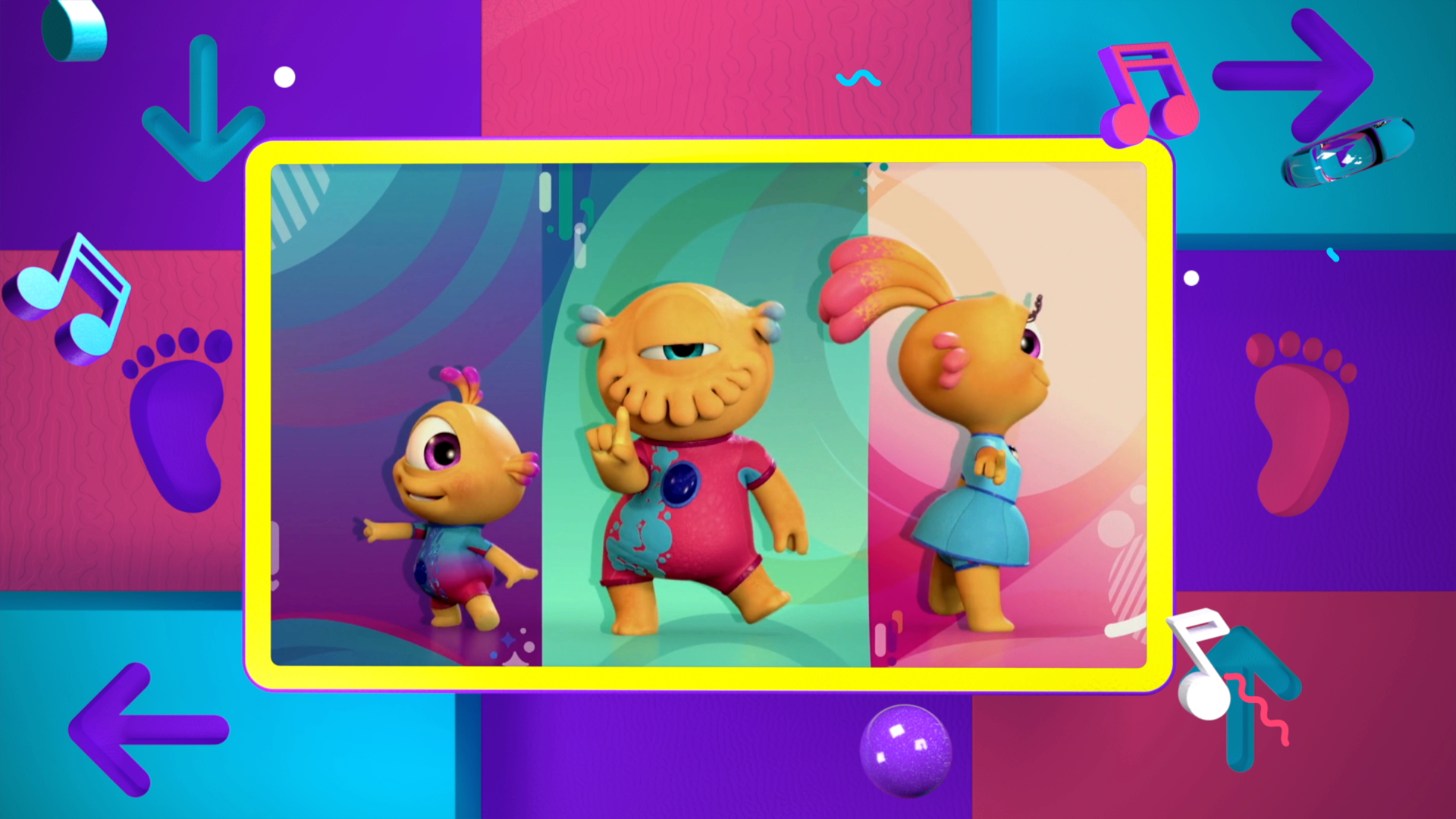
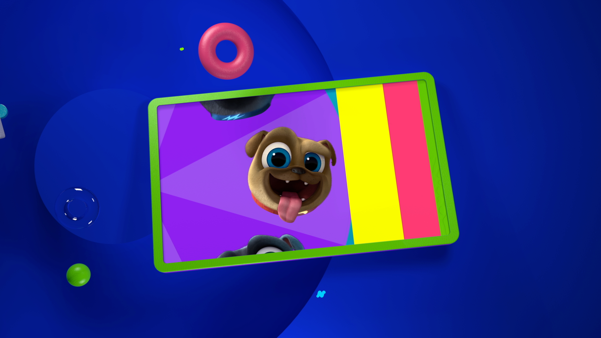
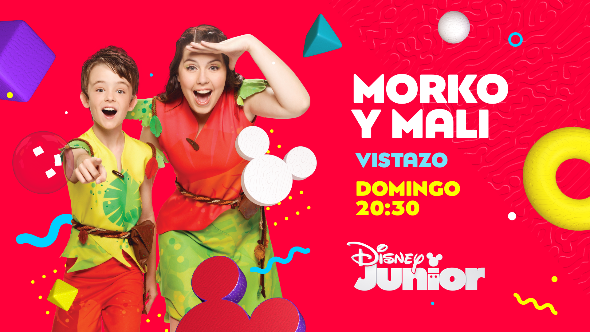
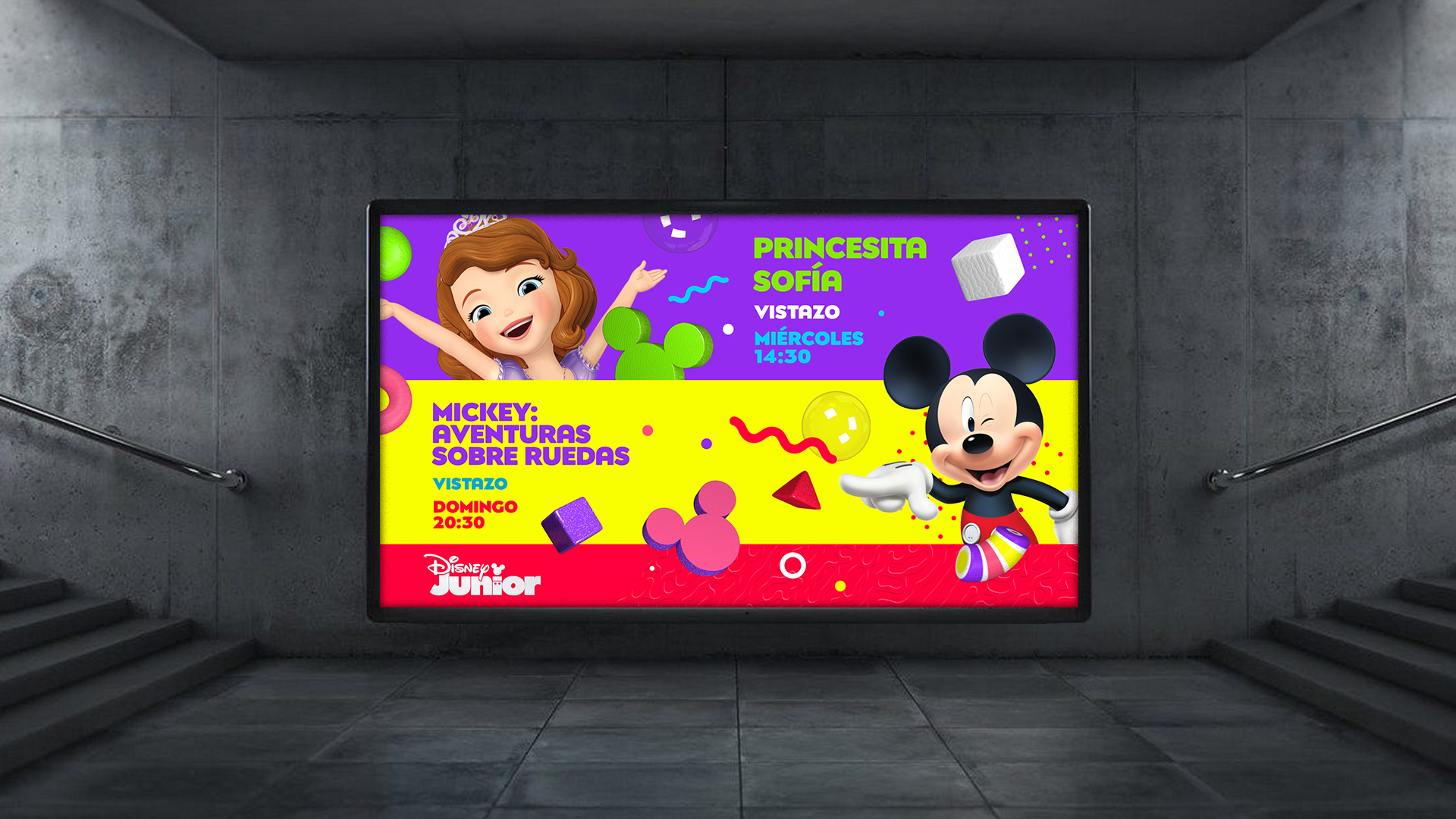
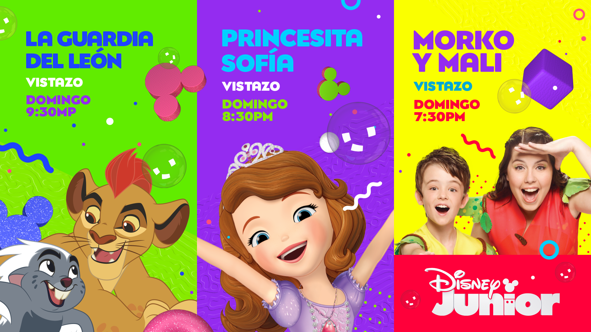
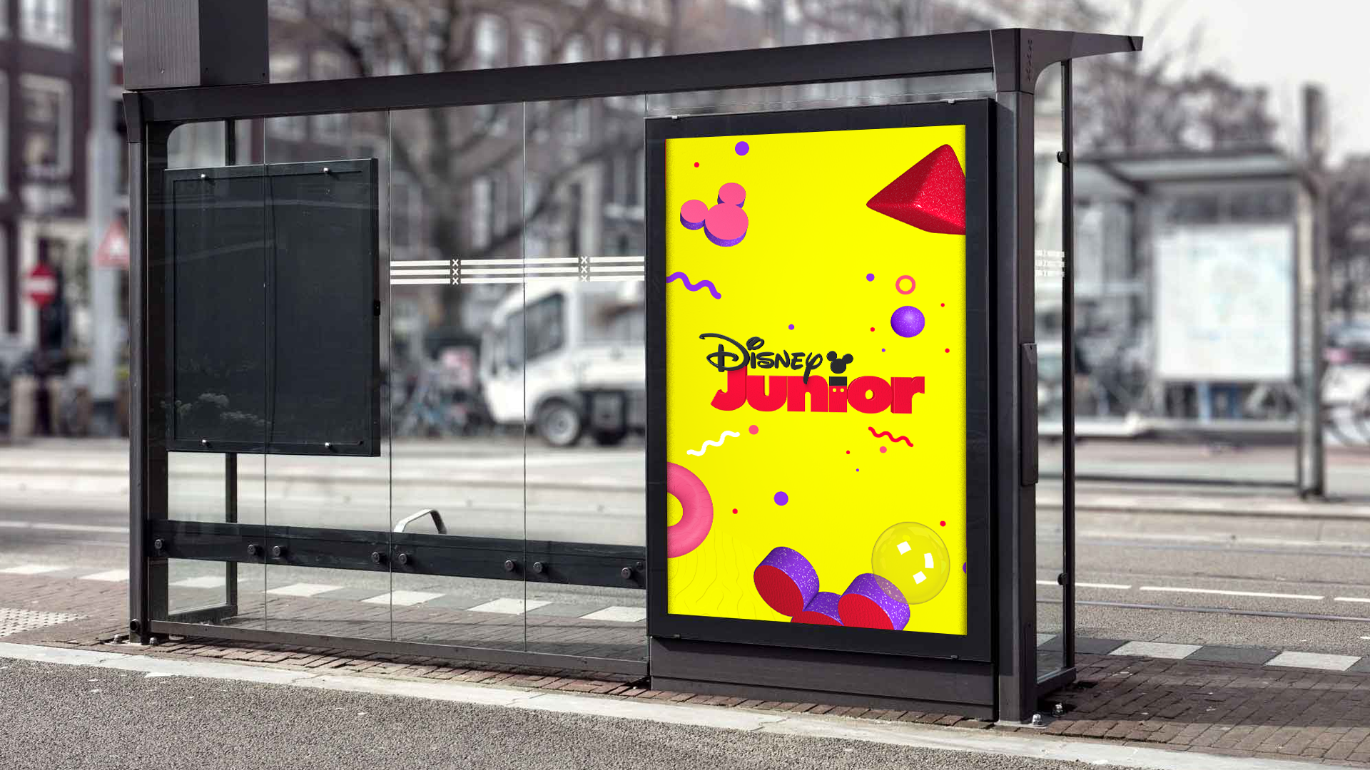
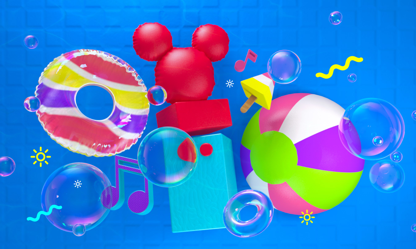
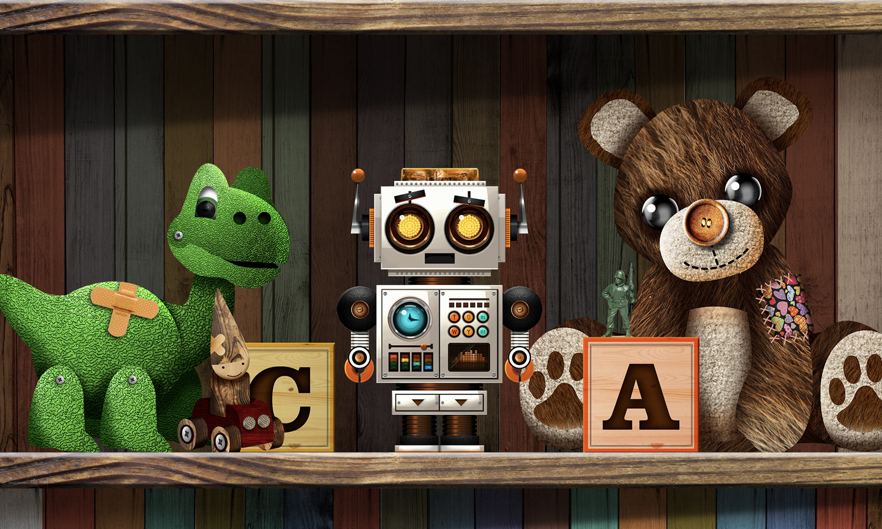
flat, with pastel colors and aimed at parents, into a colorful graphic universe, with vivid colors and almost tangible objects.
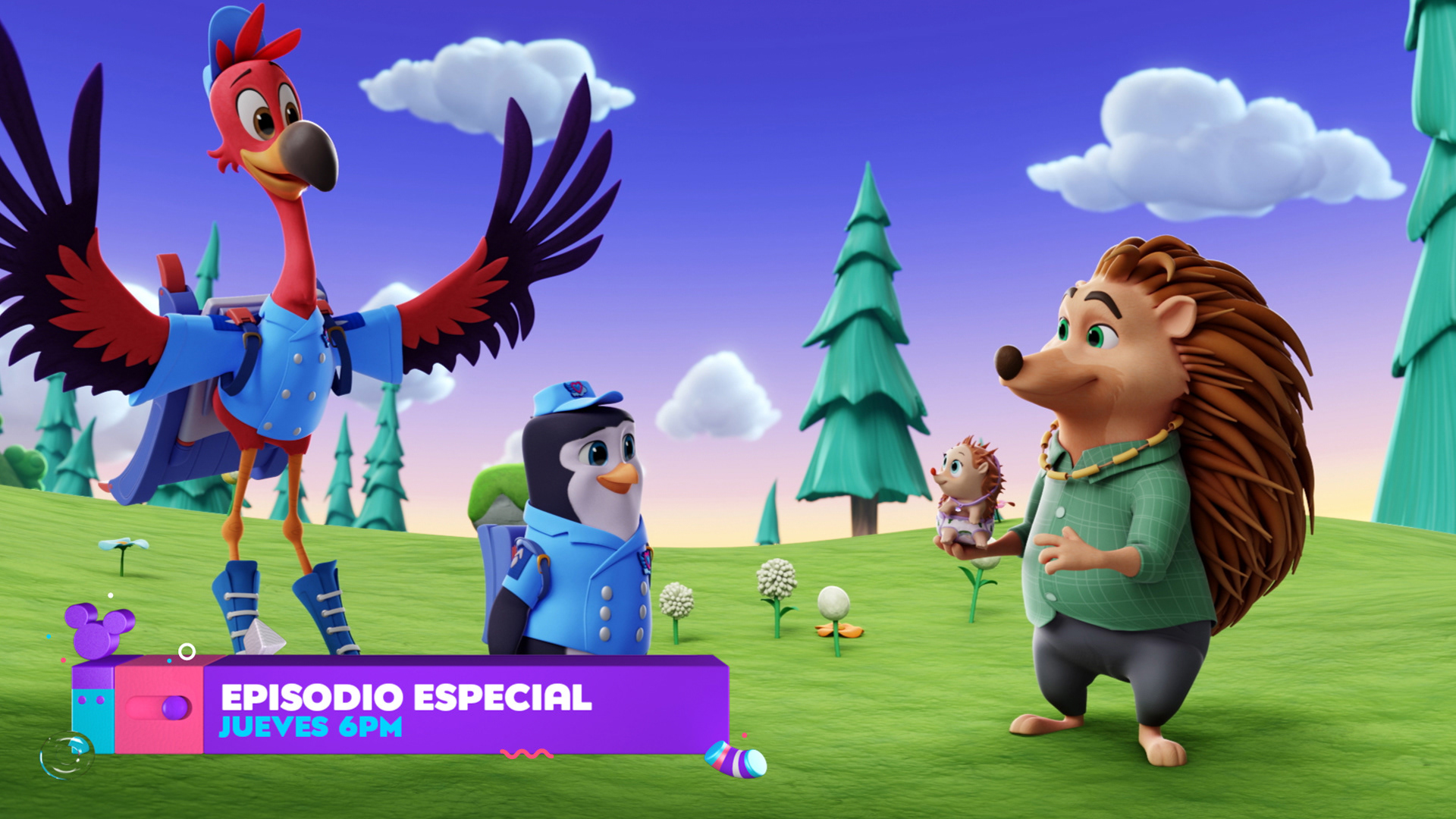
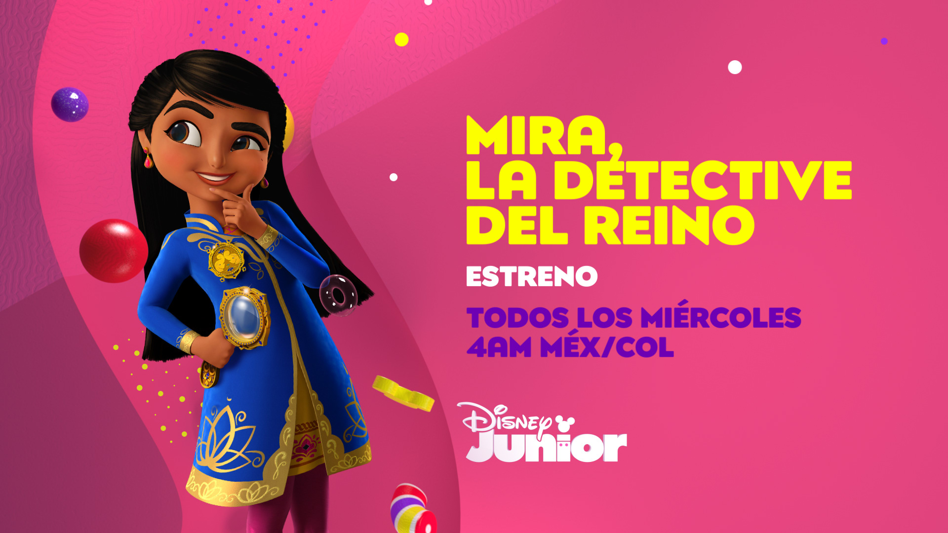
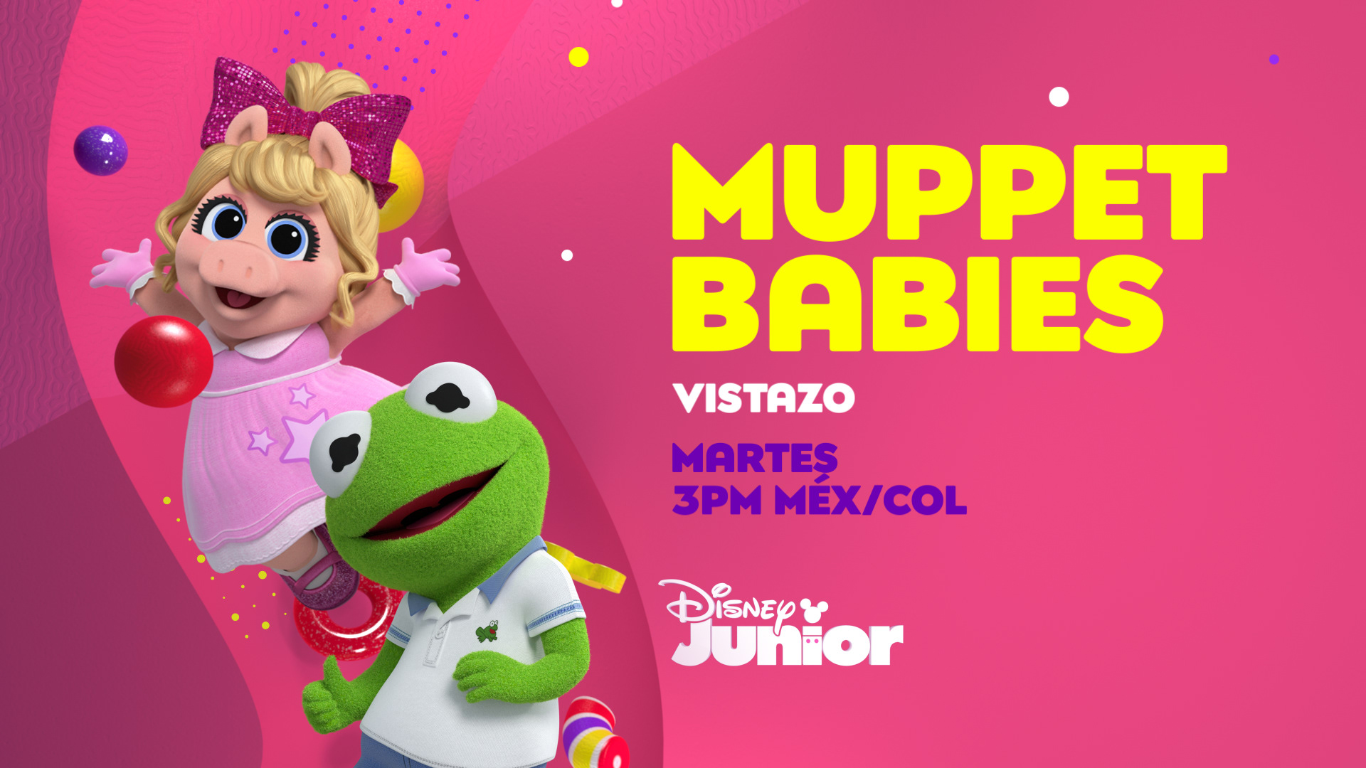
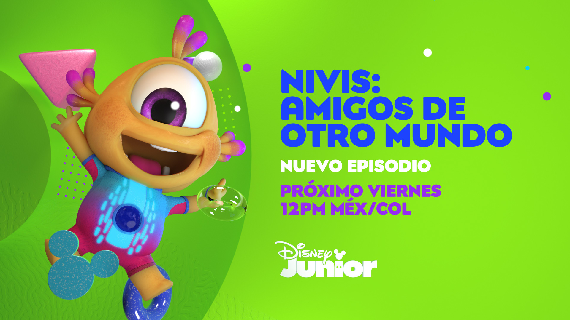
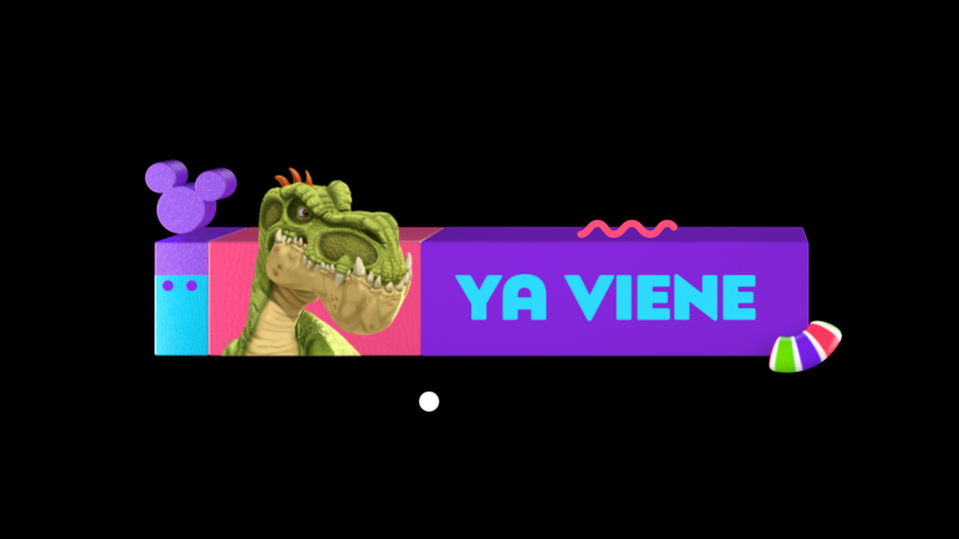
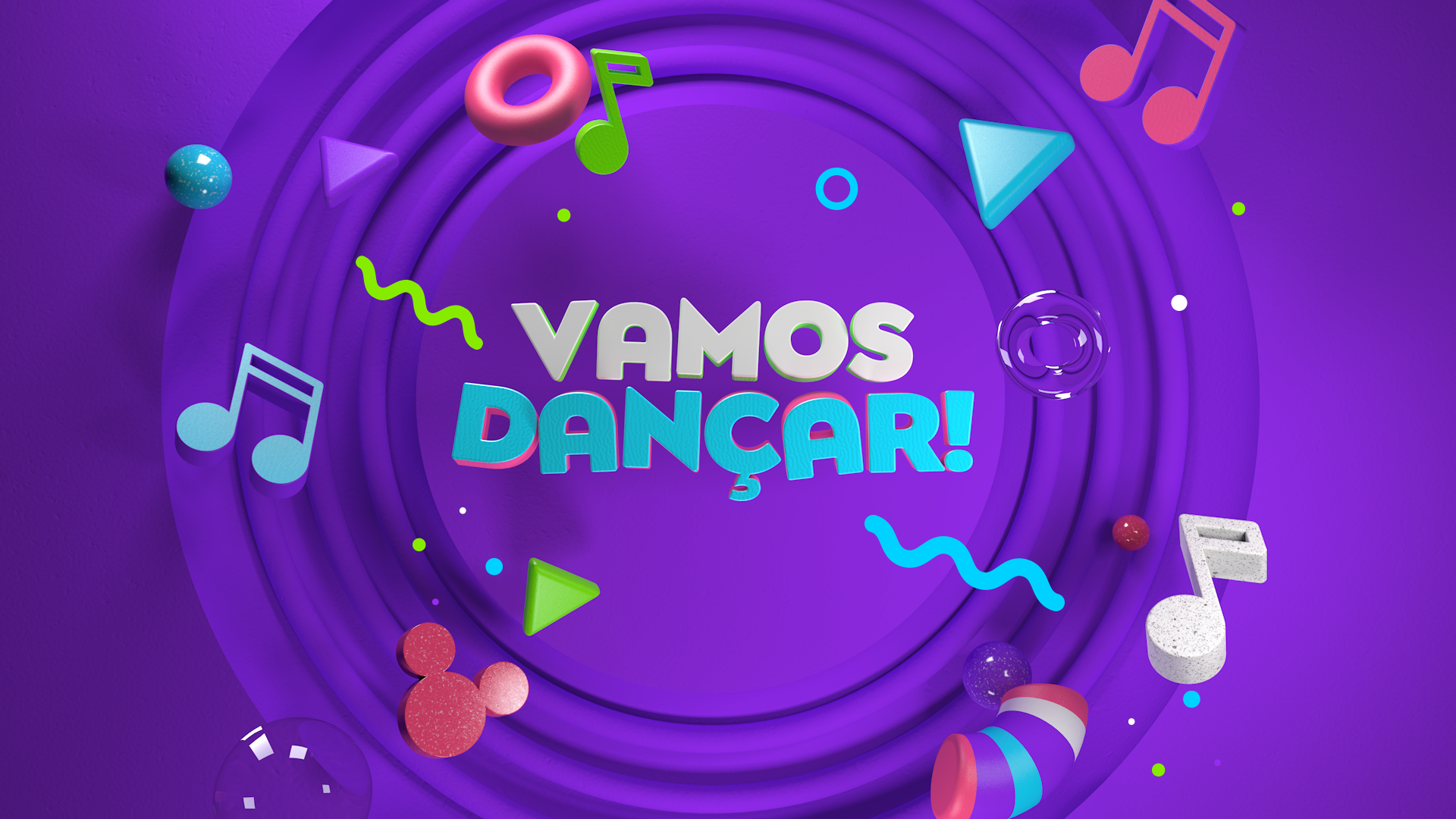
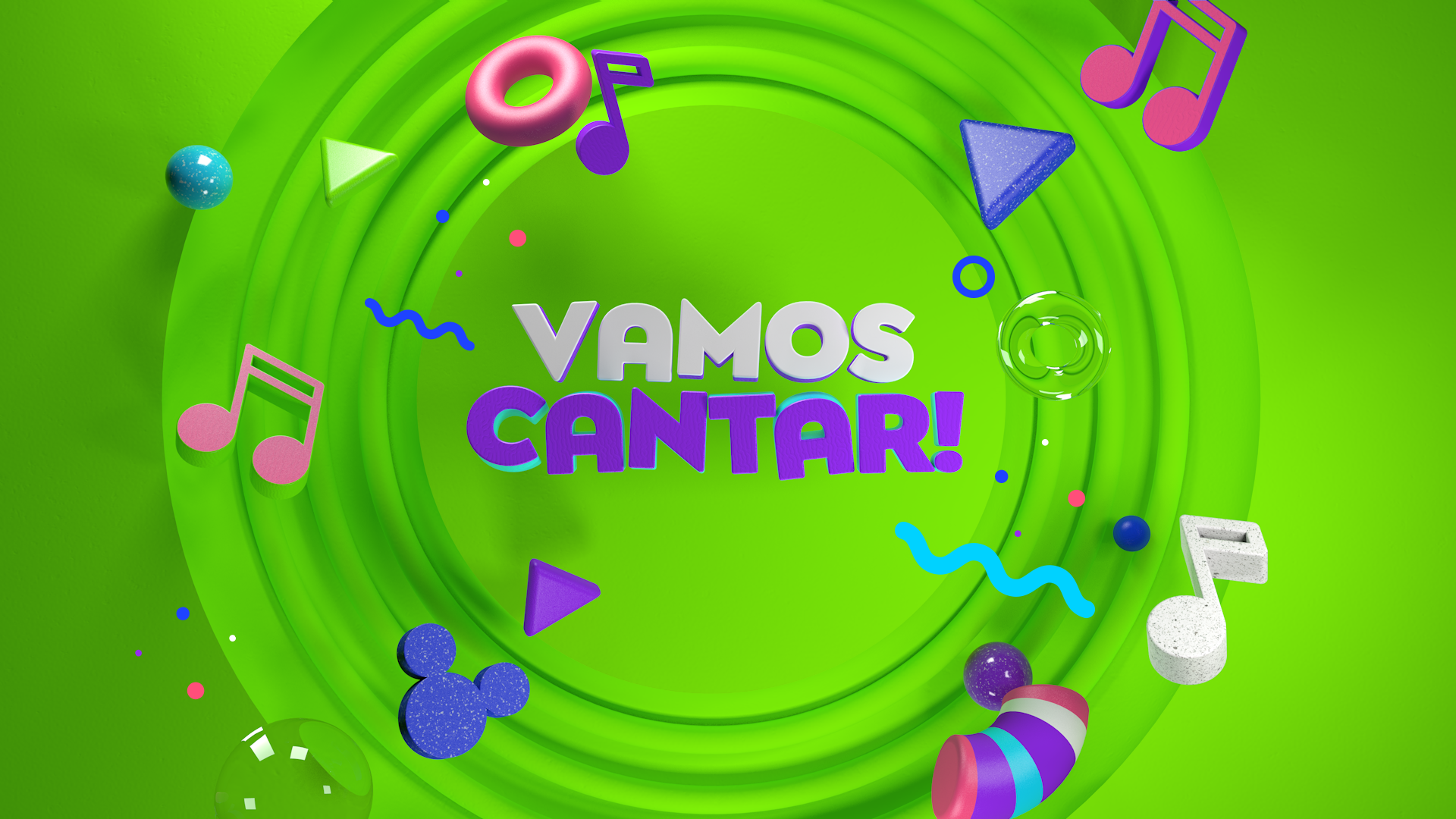
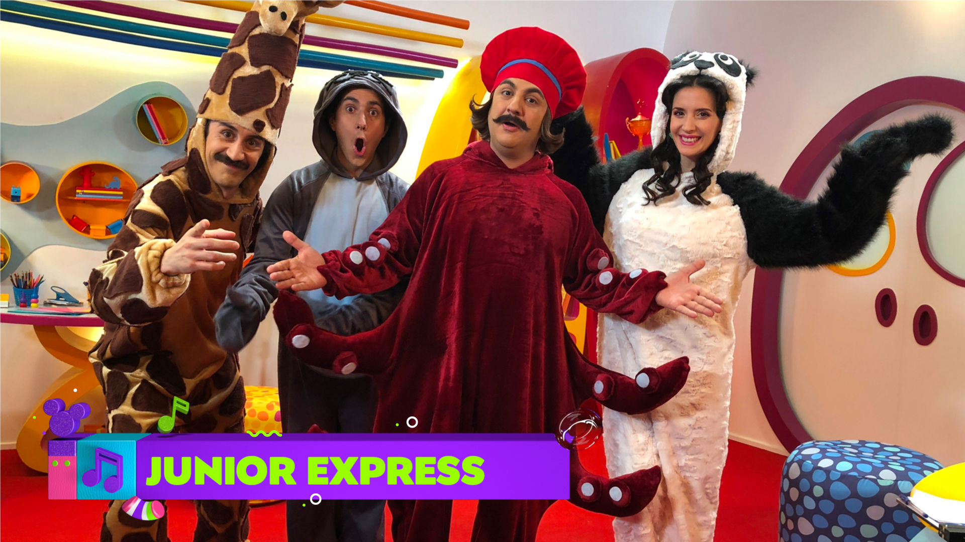
The idea behind was that each piece of the branding should be attractive in itself, something that would like
and surprise the kids every time and also clearly inform parents.(co-viewing)
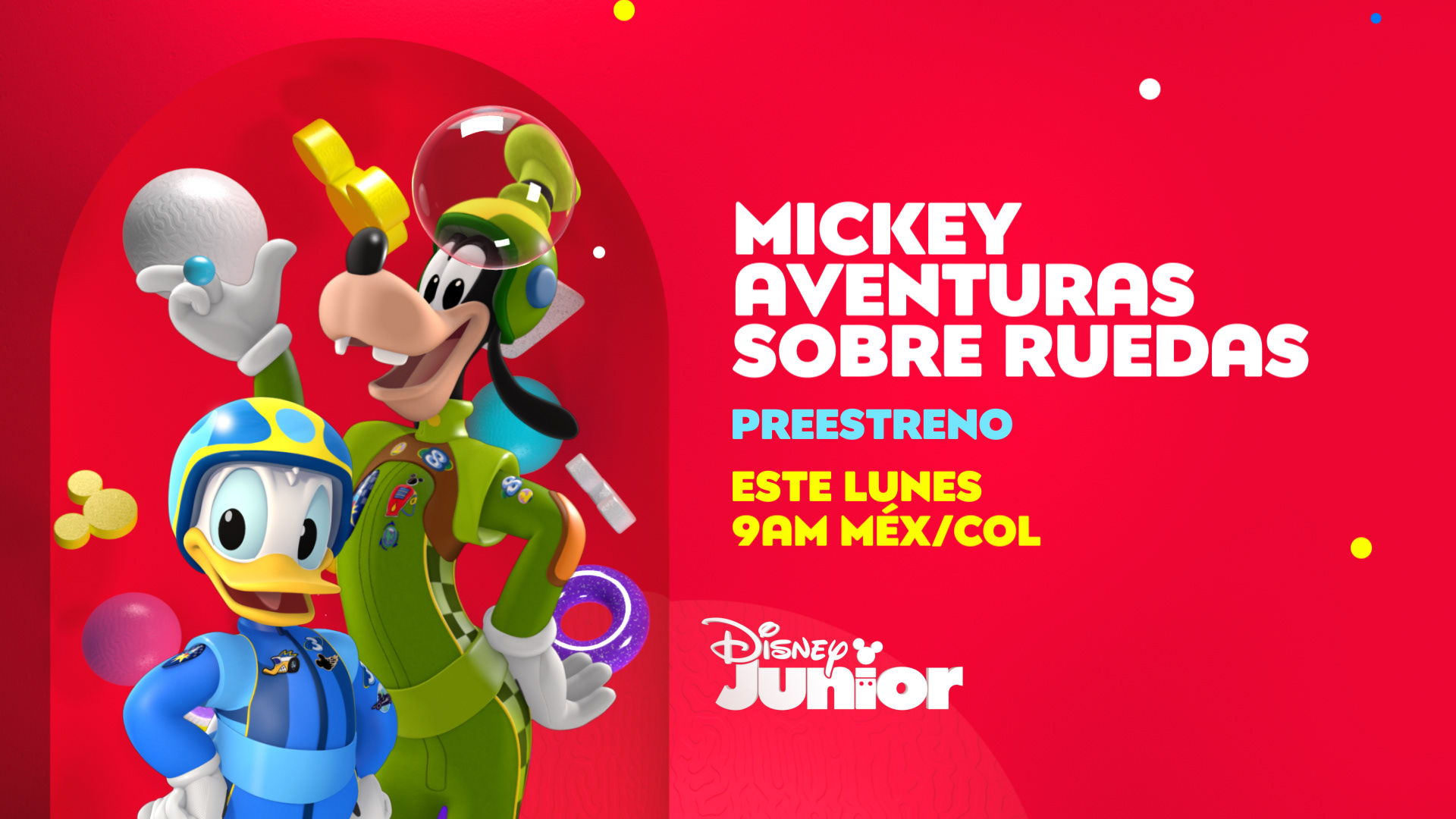
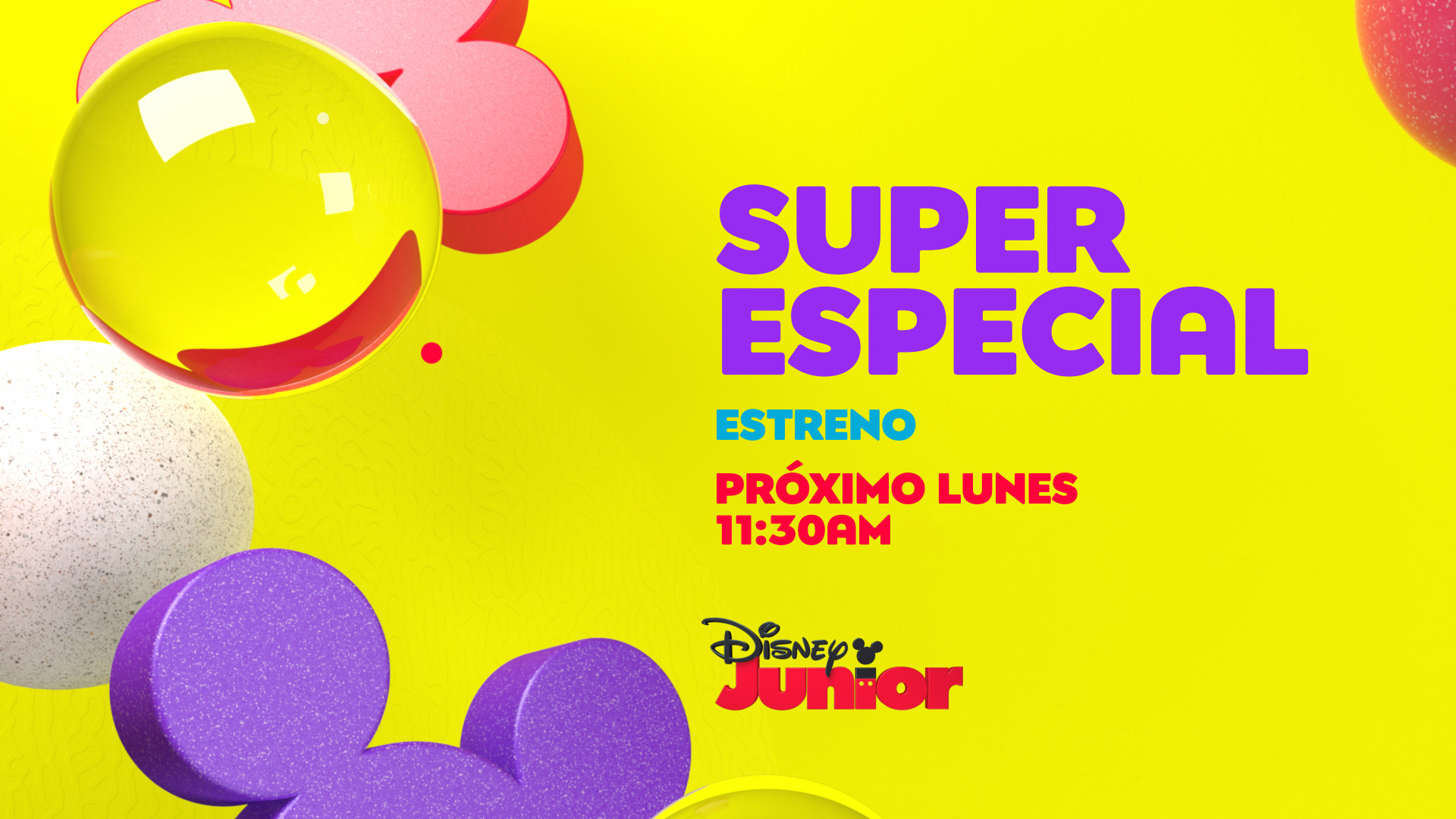
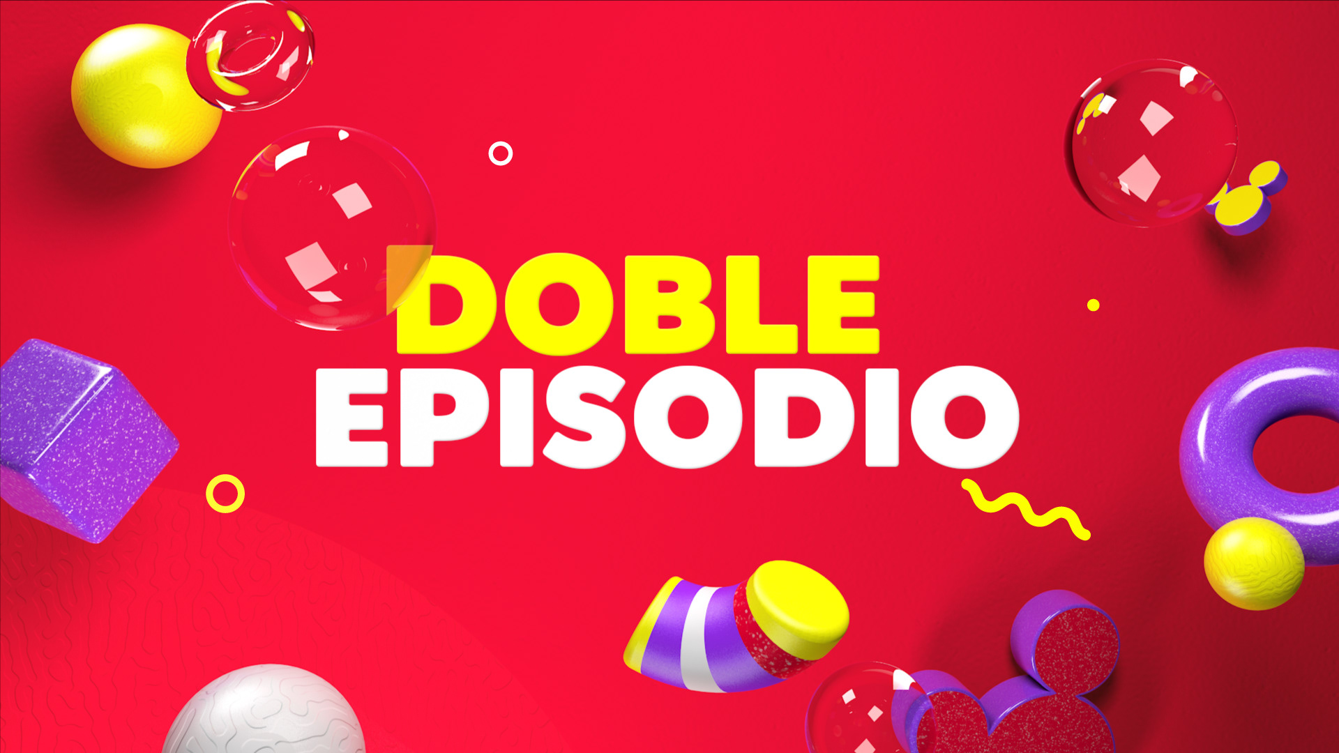
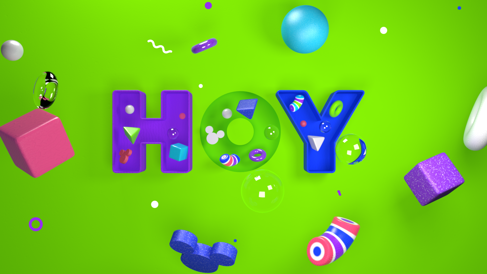
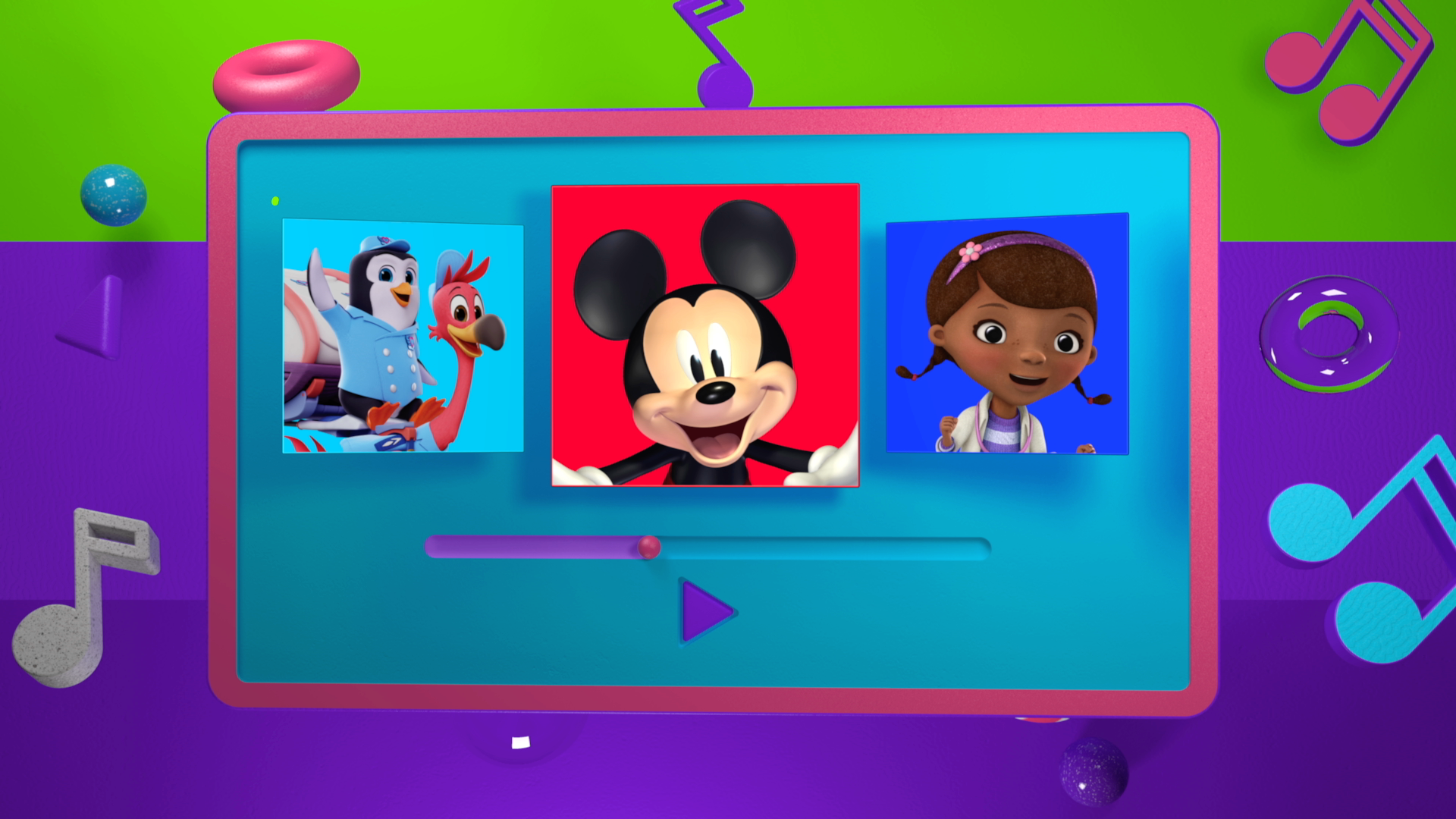
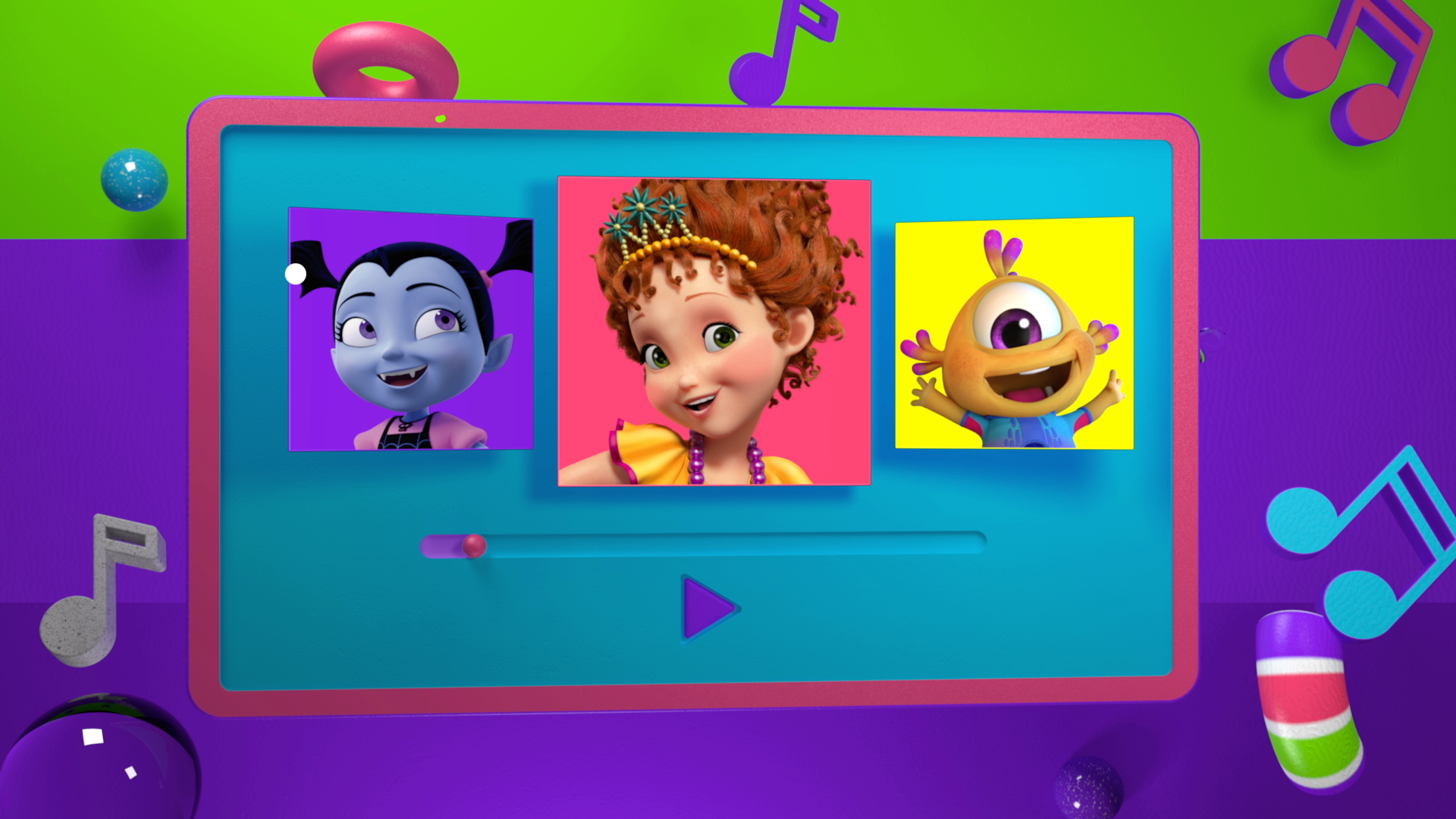
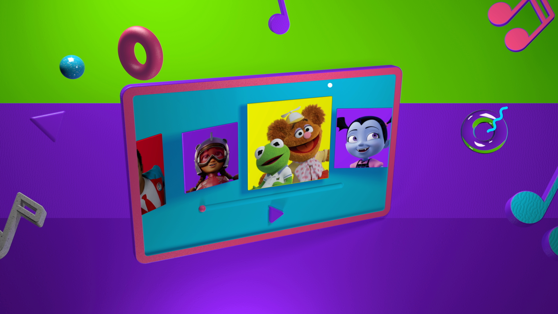
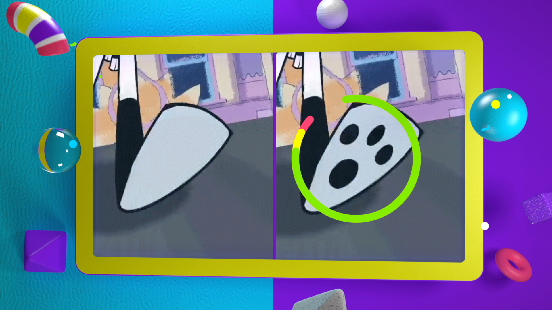
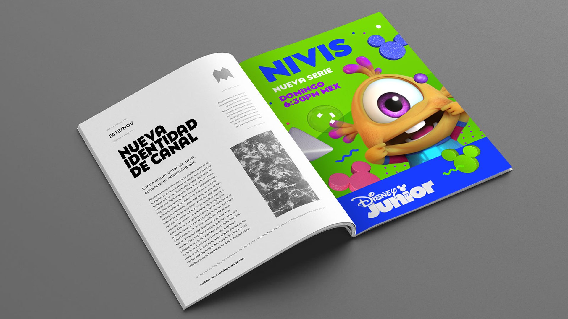
For this purpose, we worked with basic volumetric figures related to the channel's target along with 6 different color palette versions,
which at the same time could be combined with each other, that is, a promo open could be from one palette and the endpage from another,
the same as the combinations between other items, giving to the graphic system a wide variety of pieces.
On the other hand, each piece had changes in its constituent elements; the elements were the same, but scales,
colors and textures were changed. This large number of variables, both chromatic and elements, at the same time was contained
in a limited number of general animations and a very defined grid to order the info.
The result: the variables were eye-candy for kids while the constants ordered the information for the adults.